Devlog: UI



Hello everyone, it's Max here to update you on all of Club Crash’s awesome UI development and design so far.
My mission this semester was to figure out the look and ways to display feedback to our players. Sadly there are some weird format issues happening with itch right now that I will be looking into, but the screenshots attached to this post will follow the same order as our discussion.
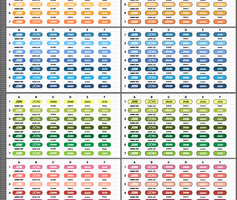
To start off, I setup some button layouts and font choice designs to find a direction we wanted to take our game's UI.Button Concepts
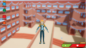
Next, we have gameplay menu concepts.
This is our current iteration, I’m sure there will be many changes.
Gameplay Menu Concept
First<ins>,</ins> to highlight is the health bar, it tells you your current health and will keep you mindful of any damage you take during the game.
Next to our health bar we have our stamina bar. It will display how much character energy you have to make actions with. Stamina was carefully discussed over multiple meetings, but we are happy with the gameplay changes. We hope this will provide an appealing entry to the game that will help limit action spamming and encourage planning out actions. This piece of UI tells us when your special action is ready as it becomes full.
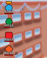
In our gameplay UI we also have our scoring system. Every action, item, and cool move will increase your score. Lead players slide to the top by the crown, while players at the bottom get cheer to help get them back in the lead. This will ensure that every player is engaged and feels like they still have a chance at victory.
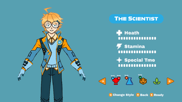
As you can see, we have designed our first rendition of what the character selection layout will be like. From here players can see each character and their stats, as week as which characters your fellow players are viewing. There are button options to change the appearance of your chosen character as well as to let the game and others know you are ready to play
We also have a loading menu!! This graphic display will be used when loading into games. The text waves as the icon spins into each clubs' logo. Let us know what you think.
Lastly, I have our first iteration of our new logo and start up screen.
This new logo screen is still heavily in the works, and I hope in the future to bring a fresh look that feels both fun and messy to reflect the club crashing gameplay.
That is mostly it for all our UI stuff for now. So, thanks for stopping by, and make sure you let us know what you think. We value all your feedback and are excited to work on making a game with the players' interest in mind.
Club Crash
Join the club!
| Status | In development |
| Authors | Studio Boulder, Lucas, FalckArts, Anna S., DrawingJordy, Lumen, Elska, zzshepherd27, AndrewHolthusen, Rigitony |
| Genre | Fighting |
| Tags | 3D, college, competative, Multiplayer |
| Languages | English |
More posts
- Devlog: CutscenesMay 09, 2024
- Devlog: Networking LeadApr 30, 2024
- Character Design and DevelopmentApr 26, 2024
- Assets & EnvironmentApr 24, 2024
- Rigging and AnimationApr 13, 2024
- Devlog: Audio LeadApr 11, 2024
- Devlog: Program Lead and UIApr 11, 2024
- Win Screens and Particle PaintingApr 07, 2024
- Level Design DevlogMar 30, 2024
- Devlog: Character ImplementationMar 22, 2024
Leave a comment
Log in with itch.io to leave a comment.