Character Design and Development
Hello, and welcome to Club Crash! I’m Jordan, one of the artists at Studio Boulder. With such a small team, I’ve had to take on a lot of different roles, but my absolute favorite has been character design. As we begin to wrap up production for the semester, I’d like to discuss some of the processes and design decisions that went into designing our characters.
It took a few months of pre-production to refine the exact feeling of our game. This was important to the character design, because the world would inform how the team designed the characters.
Everyone on our art team had to compromise on something we could all create - each artist specialized in something different, from 2D cartoon backgrounds, to realistic 3D assets, to detailed anime scenes, to semi-realistic character illustrations. While our range of skills ultimately helped complete the project, we needed to find a cohesive style before settling on a final style. Some of our early concepts included a highly exaggerated, wacky cartoon world, a slice-of-life style in pastel colors, and entirely hand painted textures.
With all of our concepts, however, our characters were designed to be the heart of the Club Crash. We took a lot of inspiration from anime and cartoons, with exaggerated features and bright colors. We needed to make sure that a fun range of characters with a diversity of personalities, races, heights, colors schemes, shape languages, and interests. Each character had to feel unique, but still look like they were part of the same world. The characters also had to be simple enough to animate, rig, and illustrate with our limited timeline, but visually complex enough to be interesting.
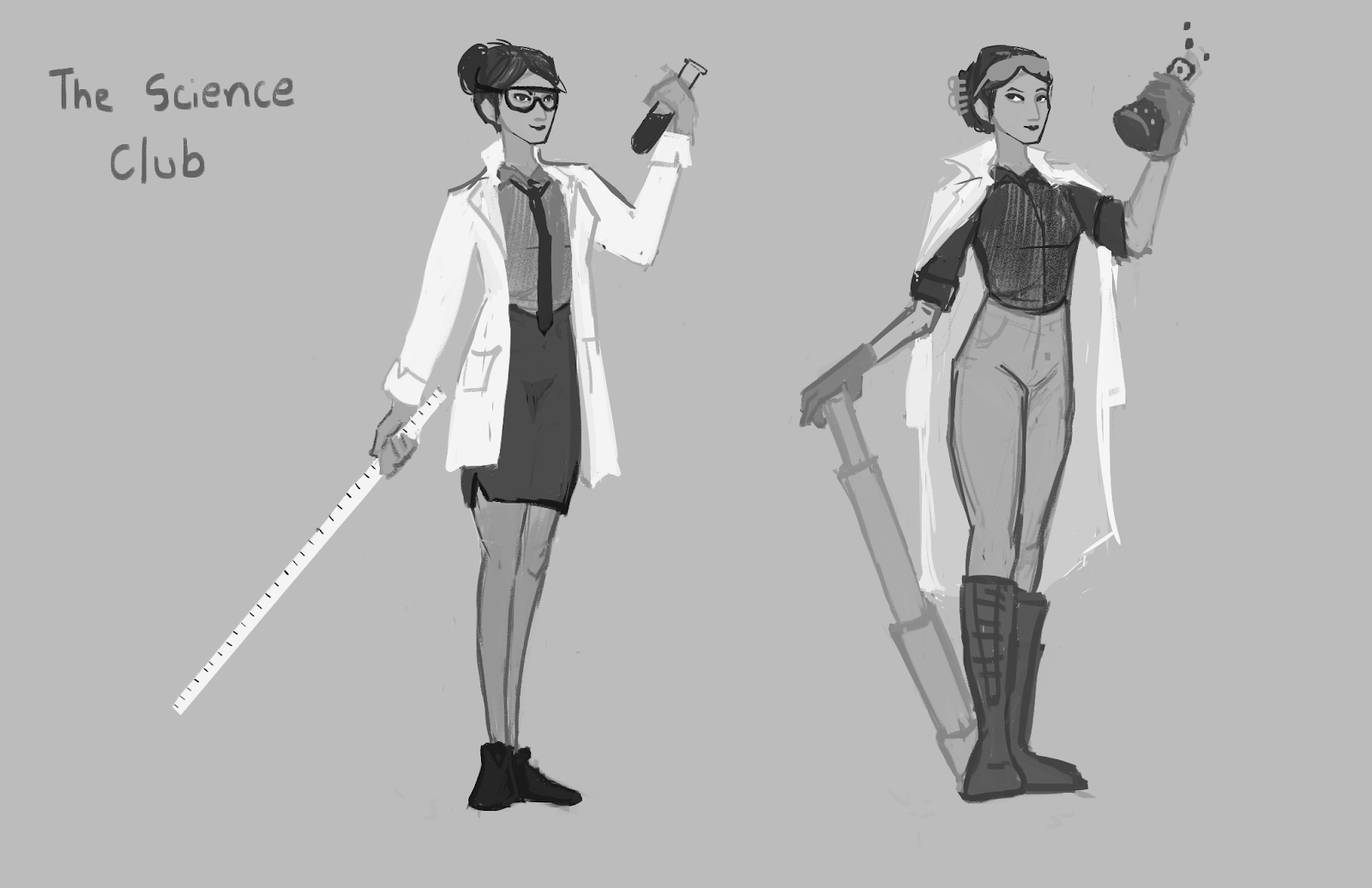
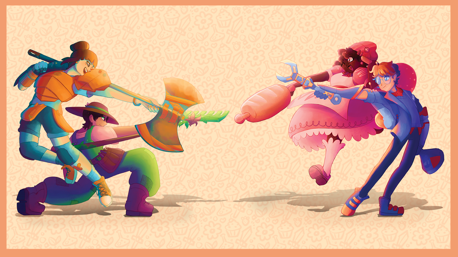
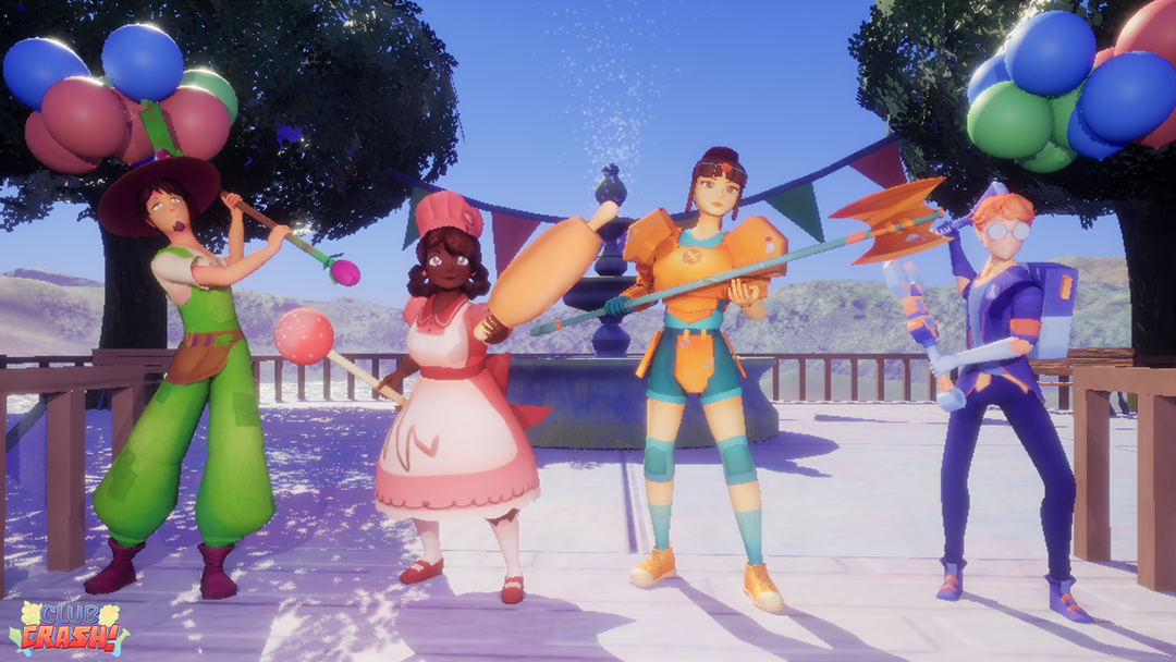
We decided four clubs with four unique competitors would be perfect for a multiplayer game, and would fit without our scope. We decided to move forward with the baking club, the science club, the roleplaying games club, and the gardening club. Some of our early considerations were the swim team, chess club, and theater club, but those were eventually abandoned.
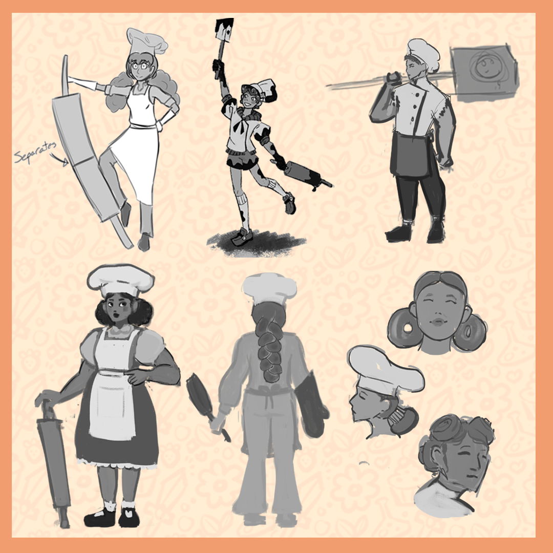
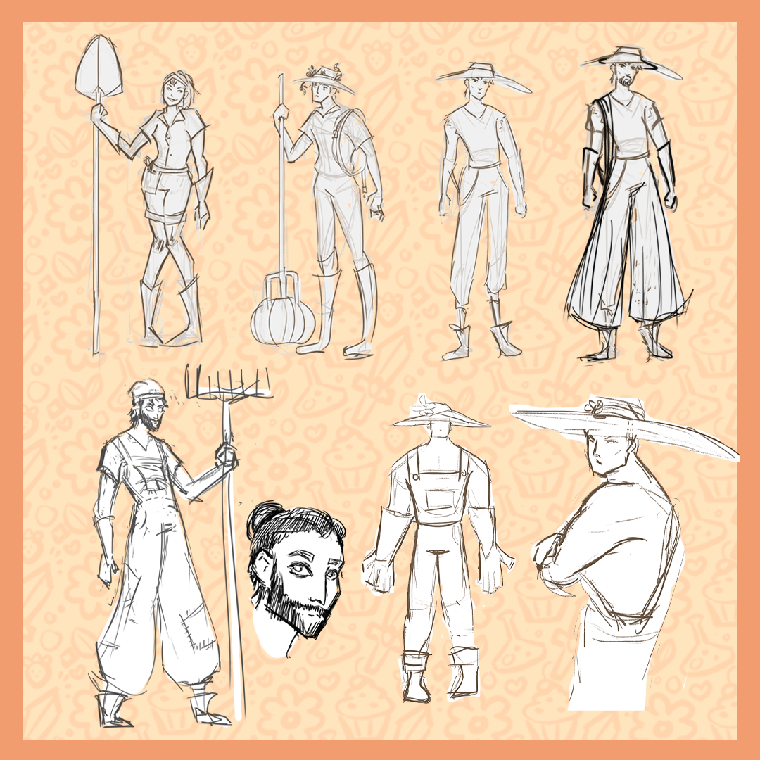
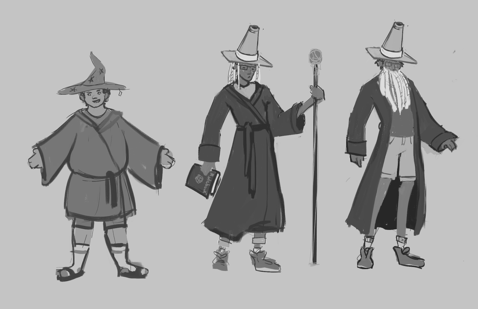
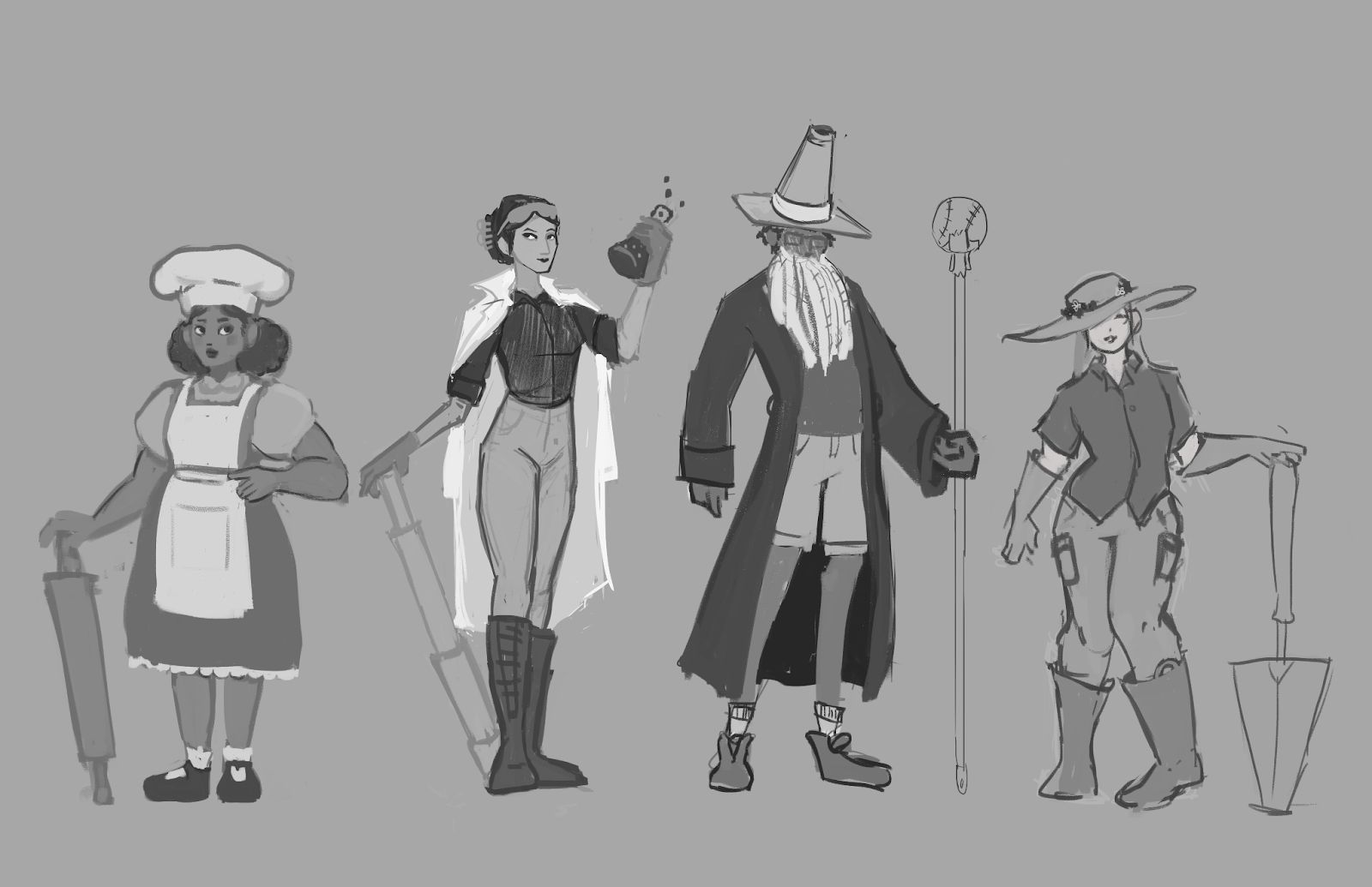
A key feature of good character design is a clear silhouette and recognizable attributes, so we needed to be sure to incorporate those. They also needed a main block of color that would create differentiation to players in a high intensity, fast-paced game. We wanted characters to be detailed, but have a slightly simplified, animated quality to them.
We also wanted to reuse assets and animations where we could while keeping the characters unique. This led to more compromises between the character designers and animator. Hanging, loose, and dangling accessories would need to be limited to avoid visual errors and stiff animation - hair couldn’t be too long and loose fabric had to be limited in all of the designs. For example, we decided against giving the Scientist a long lab coat, instead opting for a lab coat inspired jacket. It ultimately pushed us to be more creative with our designs.
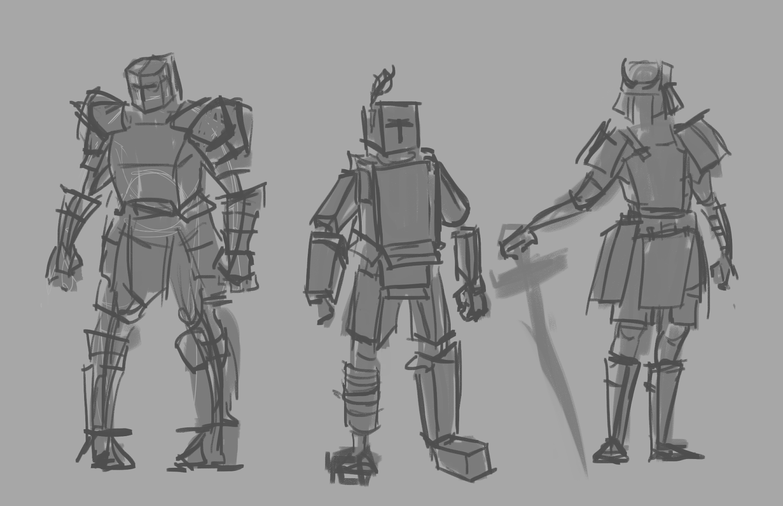
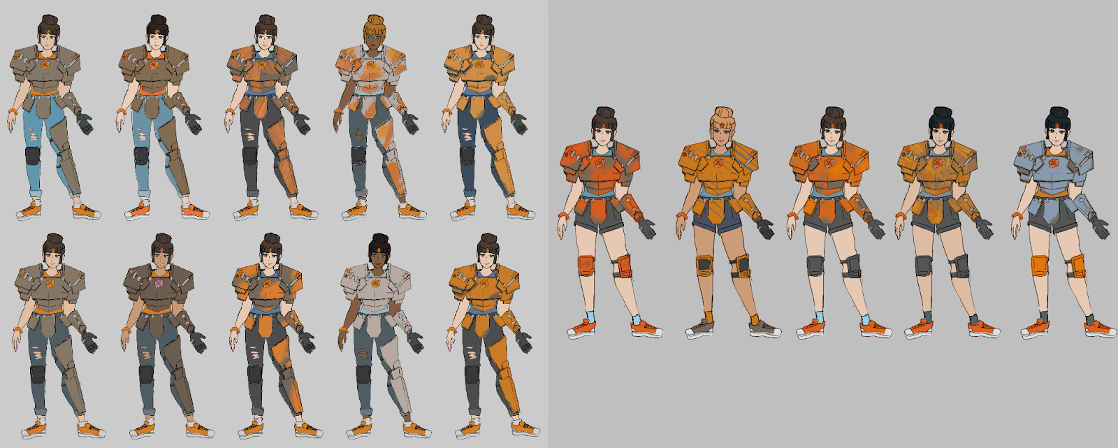
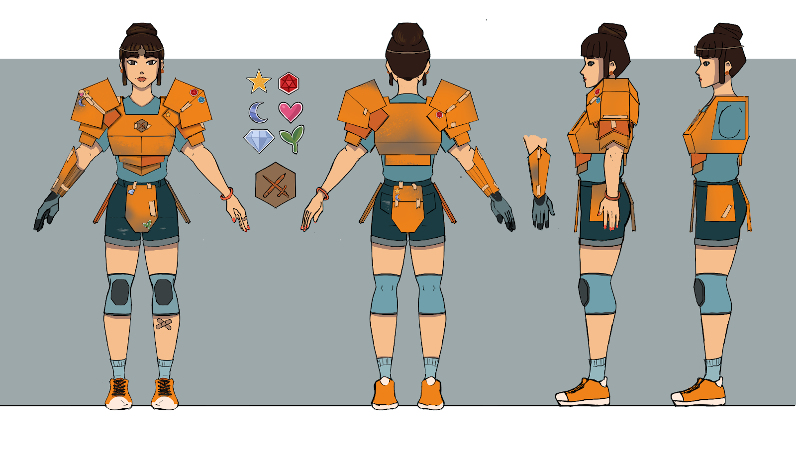
For the Roleplayer, design concepts mainly focused on a bulky armored character in cardboard armor. I wanted to push a very ‘Do-It-Yourself’ feeling from their costume, as if it were made on a budget from a dorm room. The boxier silhouette would contrast well against the slimmer concepts being created for the Scientist and Gardener. We moved her from fully armored and helmeted designs to a slightly more casual, college student look. The bold orange of her armor is multipurpose. The bright color exudes confidence, compliments the other three club colors, and is also close to the shade used on prop weapons to signal safety. Athletic knee pads and shoes were added to imply a sports background.
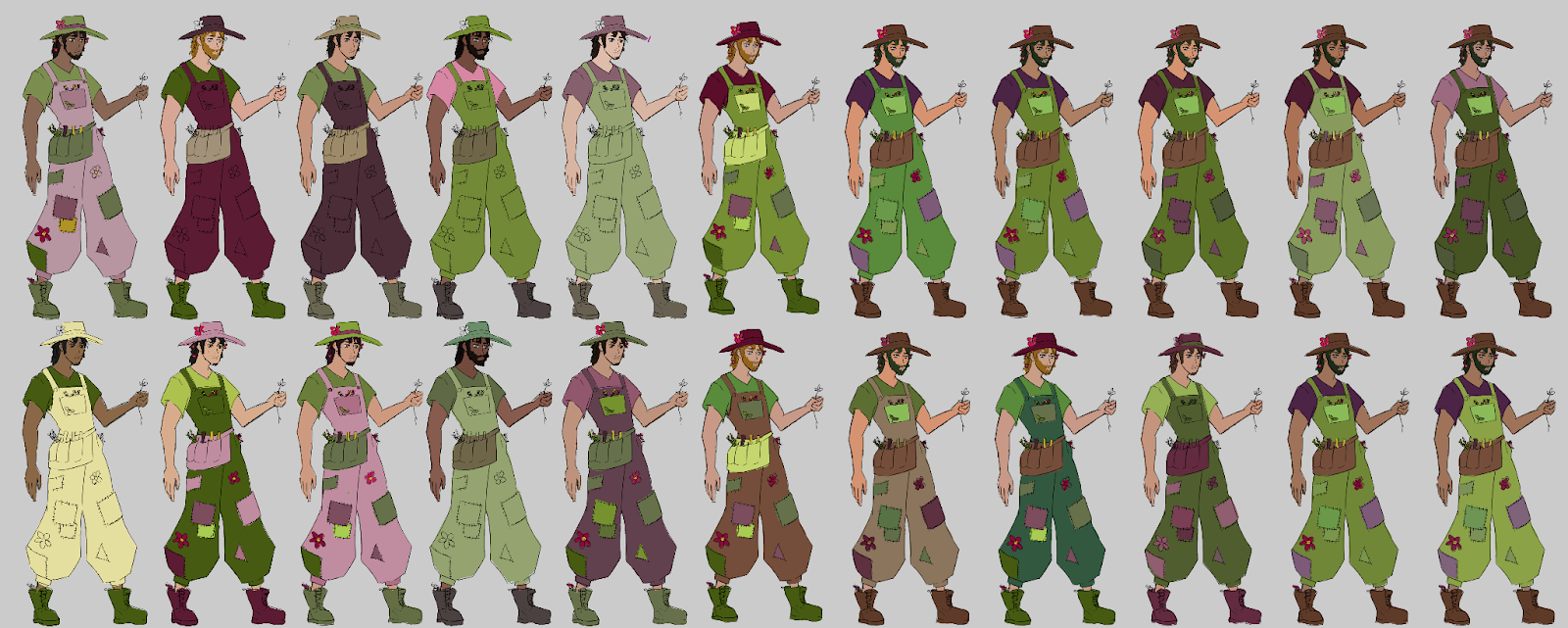
The Gardener was designed to be a relaxed character as a contrast to some of our more high energy characters. While still full of detail and character, we wanted his design to have a lot of functional elements. His toolbelt is full of tools, but also serves to break up the solid block of green and give the eye a break. We gave him an oversized sun hat, which would be practical for sun protection while gardening, but it was also a way to make his silhouette more interesting and recognizable. The Gardener’s overalls are covered in hand-sewn patches, implying the gardener is sustainable, recycling clothing rather than throwing it out. We knew from the start that we wanted him to wear green. A vibrant, leafy color was chosen to utilize the plant motif and play off of the “green thumb” and “sustainably green” idea. And we finally decided on a dark magenta as his secondary color to contrast the green we chose.
When our biggest disagreement involved whether or not to give the Gardener a beard, things have been amazing for our team. It’s great to see these characters coming to life after all of the development they’ve been through. With our final days before Stout Games Expo (SGX), things are truly coming together. It’s been an amazing experience designing characters with the team, and I can’t wait to present our final project at SGX!
Leave a comment
Log in with itch.io to leave a comment.