Win Screens and Particle Painting
Hello, I’m Savannah, a 2D artist at Studio Boulder. I act as the project director, but I mainly work on concept work, and character design for Club Crash. I’m here to give a small update on some of the 2D work for the characters in our game.
One of the most important things to the team is creating bright, fun characters to fit into the lighthearted and upbeat setting of the game. Characters went through multiple phases of iteration before we landed on what we wanted to use in the final product. Currently, we’ve been adding these character’s personalities into the game through their effects, attacks and illustrations of them.
What I have been working on recently is planning with the UI artist, Max, to plan out win state screens for the various characters.

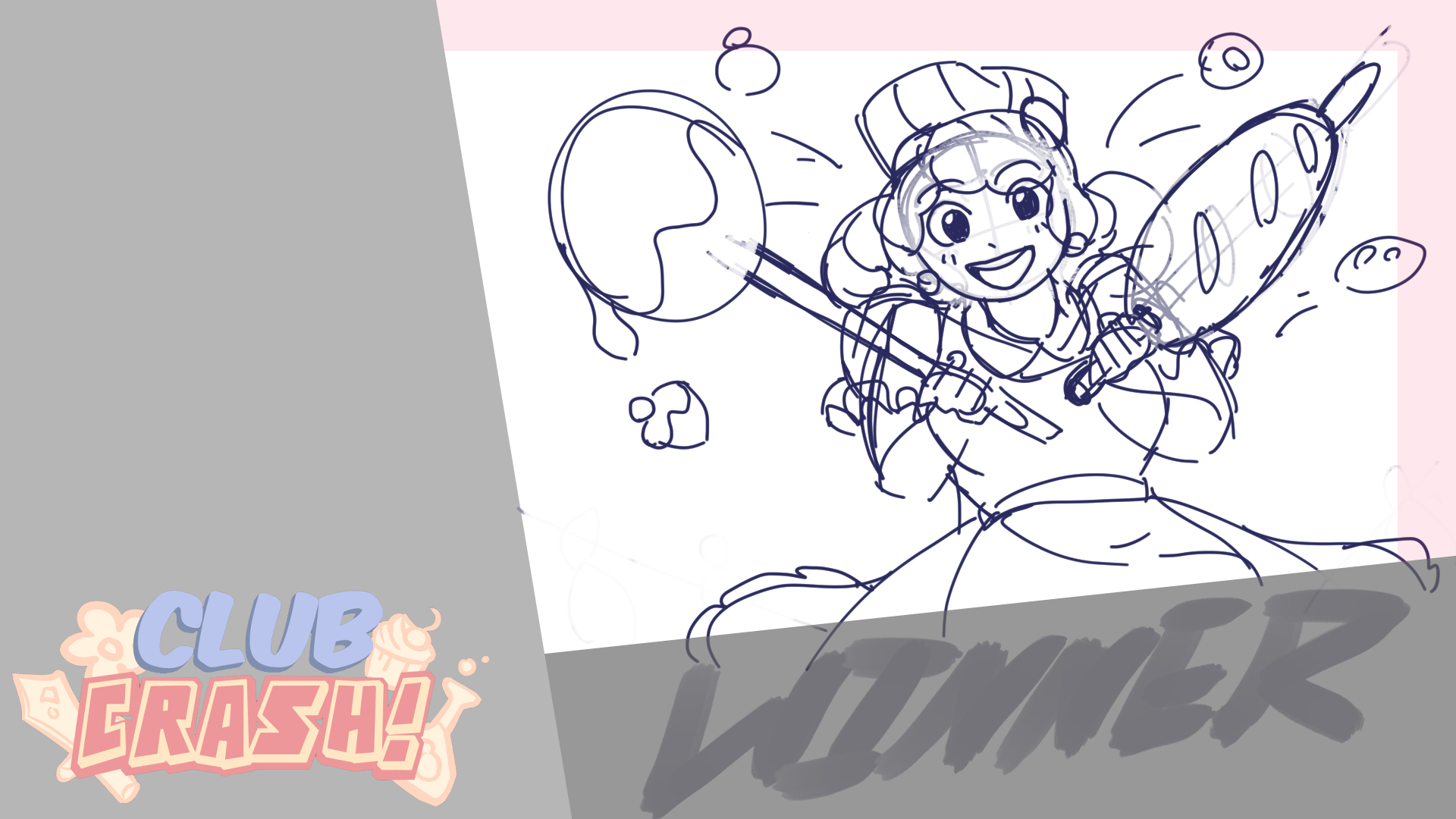
[Baker Win Screen]
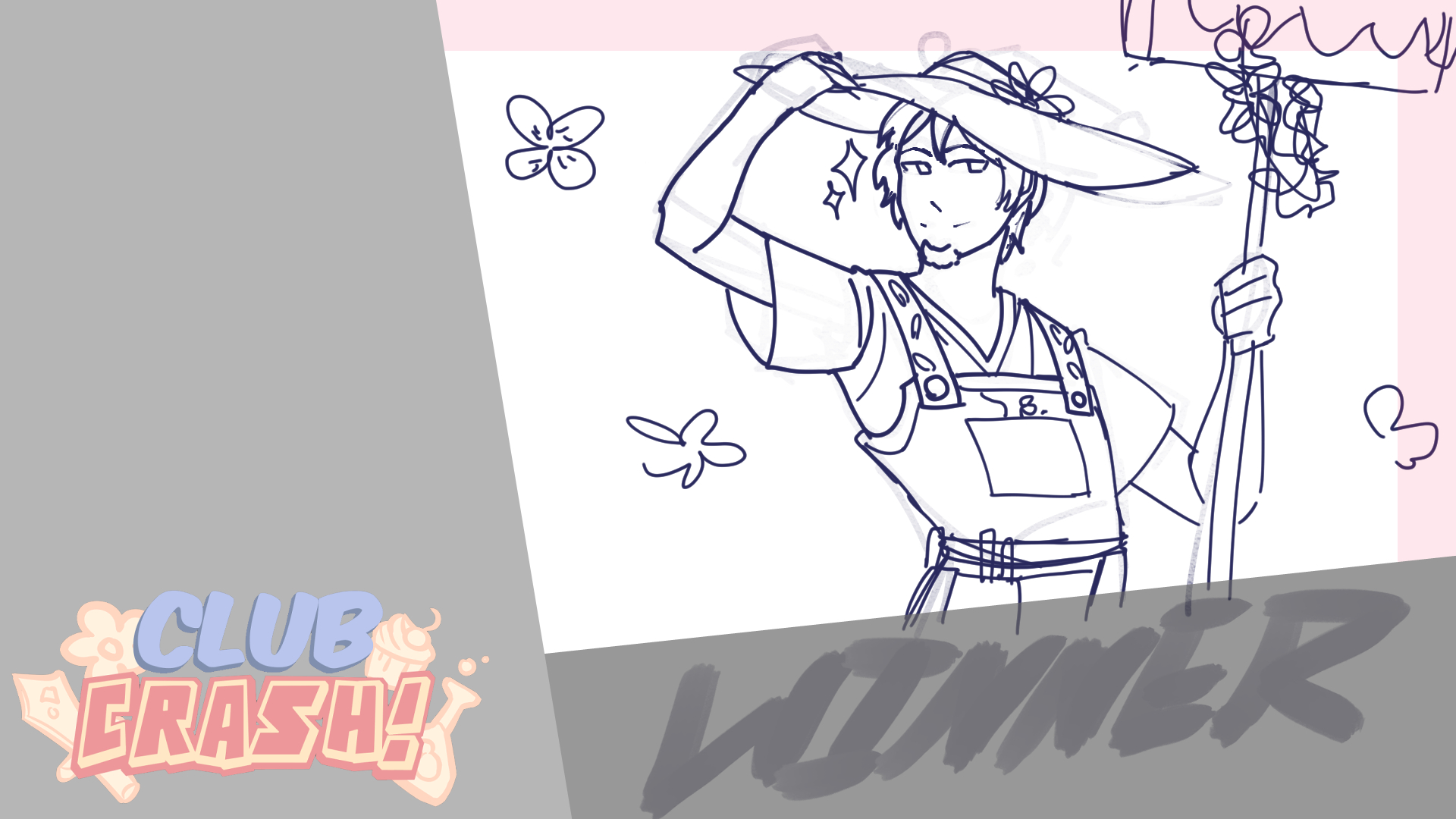
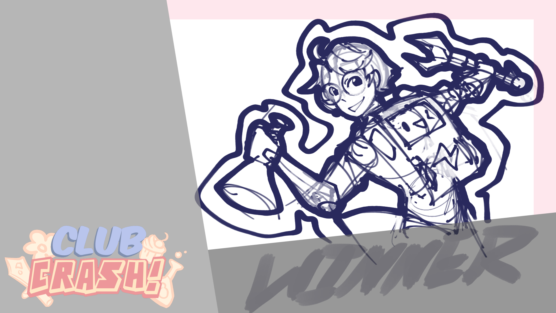
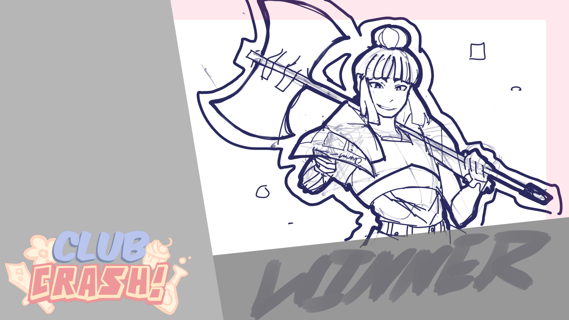
Each character is planned to have a special illustration that shows off their personality and clubs for their victory screens. It will also be a great visual shorthand to see who won as soon as you reach the end screen.

[Gardener Win Screen]

[Scientist Win Screen]

[Role Player Win Screen]
In order to create these win screens, it required a template to first be designed. In order to prevent too much from clipping off screens of different sizes, the character has to stay in the main bounding box. The rule of thirds was used as well, to keep the character in an area of interest. In order to plan out these boxes properly, I used the rulers function of my program.
Creating templates for my various work throughout the development process makes it easier to create presentable, and flexible iterations quickly as well.
Another thing I’ve been working on is creating the painted, 2D assets for characters hit, and splash effects. For each of these characters, I focused on creating assets that matched each club. Cake effects for the baker, game pieces and cardboard fire for the role player, and greenery for the gardener.
I’ve worked on each set, the only one still in progress is the scientists. For each we focused on the idea that in manga, and animated shows, many background elements are beautifully painted or drawn with great detail. This contrasts nicely with the characters who continue to pop out from the background and from the props so that they’re still the main focus. In order to create these, it required finding references, plotting them out through lists, and then creating the assets themselves. The examples above are full sheets of all the completed assets. To pass them off and prepare them for the engine however, I had to format every asset into the right resolution, and arrange them so they’re all centered. Once they were all formatted correctly, I could pass them to Max, our UI and FX artist, who was able to turn them into the hit effects in animation.
That’s all that I have for now, we’ll be getting things ready and polished over the next few weeks in time for Stouts game expo where we’ll have live demos of our project for local play. Look forward to more blog posts from more members of the team, and check out some of our past posts below!
Club Crash
Join the club!
| Status | In development |
| Authors | Studio Boulder, Lucas, FalckArts, Anna S., DrawingJordy, Lumen, Elska, zzshepherd27, AndrewHolthusen, Rigitony |
| Genre | Fighting |
| Tags | 3D, college, competative, Multiplayer |
| Languages | English |
More posts
- Devlog: CutscenesMay 09, 2024
- Devlog: Networking LeadApr 30, 2024
- Character Design and DevelopmentApr 26, 2024
- Assets & EnvironmentApr 24, 2024
- Rigging and AnimationApr 13, 2024
- Devlog: Audio LeadApr 11, 2024
- Devlog: Program Lead and UIApr 11, 2024
- Level Design DevlogMar 30, 2024
- Devlog: Character ImplementationMar 22, 2024
Leave a comment
Log in with itch.io to leave a comment.